Product Access & User Management In One Place
ConnectWise | 6 min read | 2018-2019
Note: The information in this project is my own and does not necessarily reflect the views of ConnectWise.
ConnectWise has five core products in a suite that IT professionals use for things like remotely monitoring computers and keeping track of support tickets. But, they have to log in separately to each of these products to ultimately service their customers. Additionally, there isn’t one unified place to view and manage users’ access to all products.
Goals
There were two primary goals for this project: allow users to log in just once and have access to all their ConnectWise products through single sign-on (SSO); Additionally, create one place for managing and securing access to these products. This initiative was to be released as a pilot version for users to try and supported the company’s strategy of creating a platform experience for the core products.
Users
ConnectWise's users are typically IT professionals in small to medium sized businesses. They provide IT services to their respective customers and use the ConnectWise suite to run their business. Examples of these IT services are consulting on hardware to buy and monitoring computer networks; essentially functioning as an in-house IT department. This project was meant for users using multiple ConnectWise products and administrators in charge of user management.
My Role & Team
I was the main designer that delivered mockups and prototypes, and did some light copy writing. For some screens, another designer helped with cleaning up the visual design and made sure they had the right UI components. I also collaborated with product managers, the Director of UX, a technical writer, and developers.
Design Tools
I initially used Adobe XD and Axure for mockups and prototyping; later on I used Sketch and Axure. I used Zeplin for uploading final assets to developers.
Constraints
Building From Scratch
In the initial phase of this project, I didn’t have access to the UX team’s UI components in Sketch. I was on a Windows computer and had to build components from scratch, so I couldn't work as fast as I would have liked.
Deadlines
Initially, I had to meet fairly quick deadlines for design work assigned to me.
Design QA
Around this time, the UX team introduced design QA to ensure designs were visually implemented correctly before being released. This required accessing specific QA environments that I was unable to easily do myself. Other designers in remote locations had to handle some of this that weren’t involved with the project as me. In one instance, trying to access an environment to see what developers had built simply wouldn’t work and required lots of steps. Overall, it added more time to sign off on some designs.
Consistency Across Products
This project involved more than one product. Since all these products are part of a suite, it was vital to make sure elements like copy and interactions were consistent as possible. This was sometimes challenging because the products referred to certain concepts in different ways and also had different functionality.
Technical Constraints
I had to design based off a UX style guide but could not use it for certain screens as they were still on an older UI style.
Design Process
Individual Product Experiences
One part of this project involved designing for experiences taking place in individual ConnectWise products. In these products, administrators would need to configure the SSO feature. So if somebody wanted to sign in just once with three products, they would have to go those three products to do configuration. This involved working with product managers from different business units as they were the main resource for their respective product. Overall, the process was:
- First, product managers would write design tasks in Jira to assign to me. These tasks included the necessary acceptance criteria; Addressing these criteria was how I knew designs were complete.
- When tasks got assigned to me, I would begin design. I communicated concepts through mockups and prototypes. I chose prototypes so I could get clarity on user flows and interactions. Also, it was vital to communicate this clarity back to the product managers when they needed to review. I always tried to make sure my designs stood on their own - not requiring me to be there to explain how certain elements worked.
- Once I felt my designs met the acceptance criteria, I would send them to product managers to review in Jira. If there were any issues, they assigned the design task back to me describing revisions to be made. Sometimes, we would have calls to discuss revisions.
- After product managers signed off on designs, I would make high-fidelity mockups and put them in a tool called Zeplin to guide developers.
My designs needed to show the flow of turning on the SSO feature for each product. Some of this involved adding a few elements to screens that already existed as opposed to designing something completely new, thus I could mostly jump straight into mockups and prototyping.
Example prototype: Turning on SSO in a ConnectWise product.
Example prototype: Turning on SSO in another ConnectWise product.
Later on, I collaborated with a technical writer and looked into cleaning up copy across all the products. This was done for maintaining consistency as well as simplifying instructions on how to setup the SSO feature. Specifically, we looked into things like copy on buttons and in modal dialogs.
Portal Experience
The other part of this project involved designing for experiences taking place in a separate portal, which was needed for the SSO feature to work. A large part of this portal was already done by another designer for an earlier project. I was responsible for what was known as the portal’s new settings aspect, where administrators would perform user management tasks such as:
- Allowing other users to use the new SSO feature.
- Controlling users’ access to ConnectWise products and the portal.
- Adding identity providers.
The Director of UX sketched out a high-level concept for me so I could start designs and better understand what needed to be done. During this part of the project, I worked with two dedicated product managers. The design process was mostly the same as the one described earlier with one difference: I collaborated with another designer who cleaned up the designs visually and made sure they were consistent with the right style guide before handing off to developers for the first build. After this first hand off, I had access to the necessary UI components in Sketch allowing me to go to high-fidelity mockups that much quicker.
My designs primarily had to show various user management functionality. This involved designing new screens, not just adding onto ones that already existed. Often, I would look to outside products for inspiration; A developer showed Microsoft’s Azure portal as a source. Because of the acceptance criteria, the need to represent user management, and looking at outside products with similar functionality, most of the settings screens were done in tables.

First concept for a user table. The Users and Roles sections were added to the current top-level navigation at the time.
First concept for creating roles, I explored adding instructional copy.
Second design iteration - prototype of adding a user, editing a user, and resetting a user's password. User management functionality moved to a settings section and grew as more requirements came.
Second design iteration - prototype of following up on pending invites.
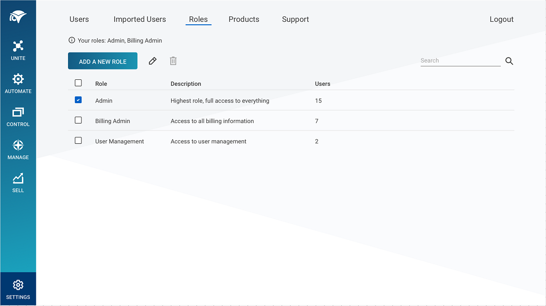
Second design iteration - prototype of adding and editing roles. Admin, Billing Admin, and User Management were default roles that couldn't be deleted. Because of these default roles being provided with descriptions, I didn't see the need to add instructional copy as in my first concept.
For the flows of adding and editing a role, I was back and forth on showing these in a page vs a modal. I decided to show these in a page because of the required functionality. It would have been a lot to show in a dialog, especially if it had to show 20-30 users for example. I also wanted to avoid the scenario of a dialog on top of another dialog, particularly when adding and deleting users for a role.
I had to design one feature that caused a bit of a debate. The feature allowed an administrator to give portal access to a ConnectWise support agent to help with resolving issues. The debate was around how the feature should be represented. I had recommended showing it through some sort of help menu and a dialog. Other people had said to possibly add it to an existing page or put it on its own dedicated page. I recommended my way because the feature was small enough that it didn't warrant a whole page and adding to existing pages wouldn’t have made sense categorically. I also looked to examples from other products. I prototyped examples of what the experience could look like having its own page or through a menu/dialog sharing my rationale. Ultimately, it was decided to put the feature on its own page because of time constraints as it was the fastest way for developers to build it. I felt okay with this direction because there was talk about possibly expanding the feature later and I knew we could revisit the design direction.
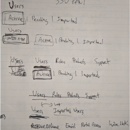
Later on when there wasn't a rush to meet deadlines, a product manager, the main developer, the Director of UX, and I had a series of meetings to evaluate the portal screens' current design state and documented what to improve. I would also continue to document things in my own time. One thing we talked about was how to combine two sections ( Pending Invites and Current Users in the mockups above) into one to reduce and simplify the settings navigation. In my very first design, I explored combining these two. However, I pivoted towards separating them in my second iteration because I thought it would be faster for administrators to see what was known as users in a pending vs an active state; They could at a glance see which users need to be followed up on. Ultimately, I felt good moving forward with combining the two sections because it reduced some redundancy and also provided clearer feedback to administrators in one screen instead of two.

Exploration sketches for combining the two sections.
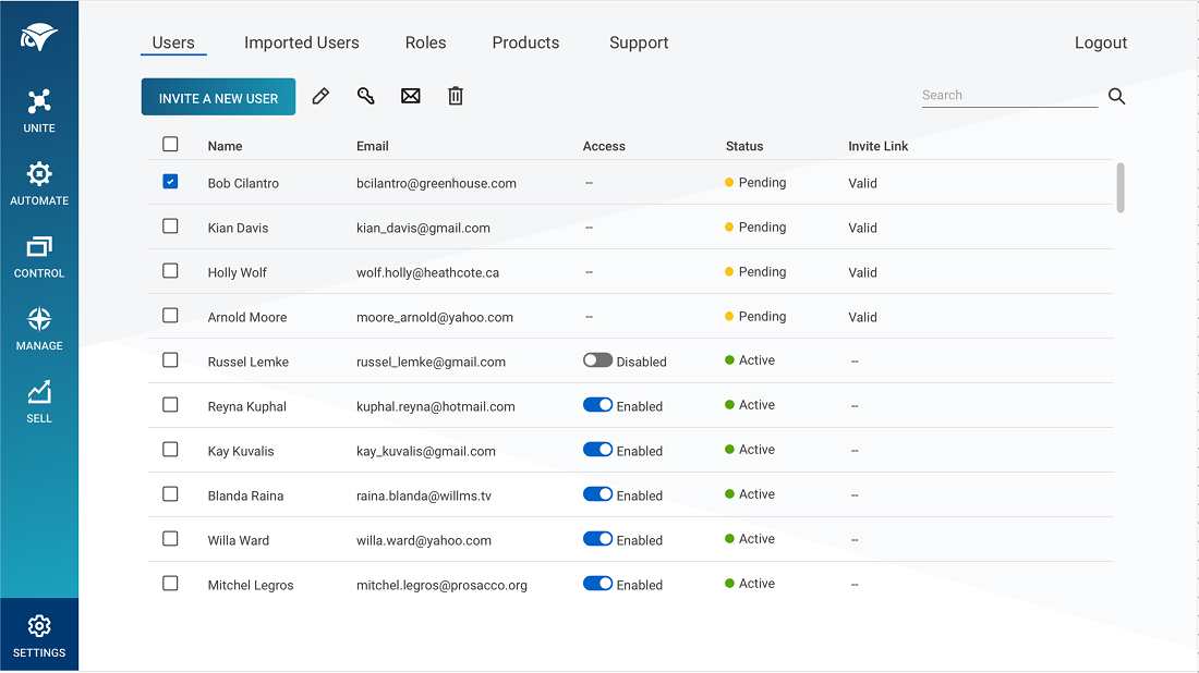
The latest designs ended up reducing the settings navigation by combining the Pending Invites and Current Users sections into a Users section.

Example of a final mockup I uploaded in Zeplin that developers built - users table.

Another final mockup - Roles table for assigning permissions.
The Result
ConnectWise released a pilot version of this user management/single sign-on initiative and was continuously developing it.
Retrospective
User Research
There were plans to get feedback by watching users do certain tasks to evaluate usability, however this did not go through. Ideally, there would have been more of a push for this research even if this initiative was only a pilot release that users could choose to try. I wish I would have at least gotten some feedback through quick sessions from internal colleagues.
Copy
I wish copy was given more attention, it didn’t feel like there was order around this. For example, certain concepts were being referred to in about four different ways. There were style guides on how UI components should look, but nothing on how copy should be written.
Sketching
For certain screens, I wish I would have done more sketching as part of my design process. I feel this would have quickly helped me with exploring ideas and have a better understanding of certain flows.
Next Project